August 9, 2025
It's finally time to unveil the "Poppy Hill" series, which took a long time to get going. I decided to wait until it had reached at least a toddler stage, stumbling around but at least able to walk, so that it couldn't be killed in the crib, like the last series.
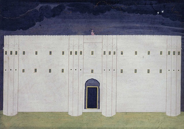
When I got back from Japan (a year and a half ago?!), I knew it would be tough to figure out how I was going to put that experience into my painting. Or if it was even going to be possible, without doing some kind of cultural appropriation mumbo jumbo, a "touch o' Zen," like countless 外人 before me. I was really interested in the way that Buddhist temple architecture combined inside and outside, like the enclosed dry garden at Ryōan-ji in Kyoto (pictured above), but I gave up pretty quickly. I just couldn't make the translation.
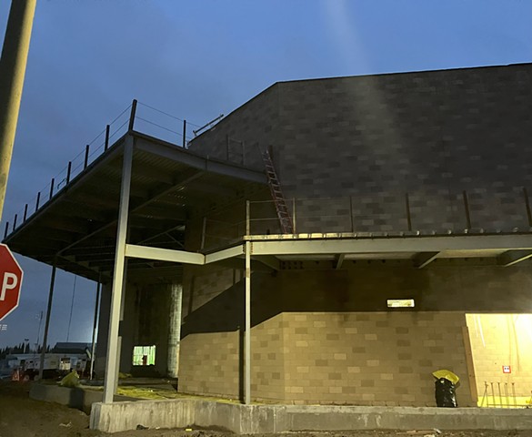
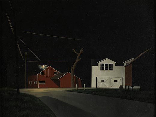
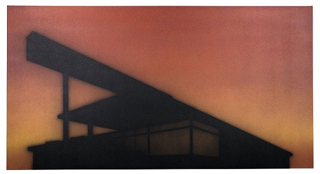
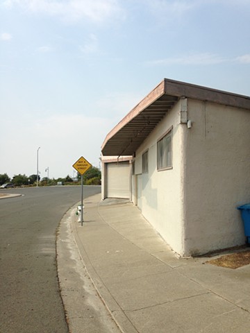
Then, in 2024, I started to become fixated by the weird artificial cell phone tower trees on the hill near the local Lowes. There are two little box-shaped buildings with awnings, which I assume house the telecommunications equipment, and behind them are two beautiful trees, maybe California oaks. And next to those are three goofball artificial trees, looking nothing like the oaks and looking nothing like each other, either.
The two by two arrangement really tickled me, so I erased the third artificial tree so there would be two goofy trees, two real trees, and two little houses. But the paintings with the little houses didn't turn out well. I had to photograph them from a distance, and I just couldn't get them to look like anything special.
At the same time, I was thinking about doing split views on a single canvas, which I'd seen in several of Hung Liu's paintings -- a close up view of the artificial tree on one side, a distant view of the hill on the other.
But I was feeling the pressure to put Japan in there somehow. The little houses were becoming less and less interesting to paint... so why not put another tree on the other side, a real tree? Not to contrast "real" against "fake," but to highlight the artificiality of the trees in Japan, particularly those planted at Buddhist temples.
The idea sprang from a conversation with Gavin Campbell, who was my guide at Ryōan-ji. As Dr. Campbell explained, the famous dry garden today looks quite different from when it was originally designed in the 1400s. There was a walkway right in the middle of it, and the walls were higher. Every tree was planted to create an aesthetic experience for the visitor, and whole armies of expert landscapers ensure that nature conforms to the built environment.
So that's kind of what the series is about. But, as I wrote on the home page, I'm also thinking about technology and how, with AI, it has entered a whole new level of artificiality that makes fake cell phone towers look rather quaint (along with the whole art-world argument about "real" vs. "fake," going back to Duchamp's Fountain and Elaine Sturtevant's copies of Warhol's copies).
I'm still not entirely sure where I'm going with this -- again, it's a toddler and it's bumping into the coffee table. There are so many assaults happening right now on humanistic values that it's hard to focus on one thing, as an artistic concept. But, as a professor of art history and as an artist, the "AI thing" is having a direct impact on my day-to-day life, and it seems like part of a larger attack, rather than a separate or side issue. The Hydra has many heads but if we could slice off this particular head, I think we'd have a better chance against the others.
Anyway, I'm hoping "Poppy Hill" can keep going a little longer. If so, I'll take pictures of other cell phone tower trees and no matter where they're located, maybe I'll just call them all "Poppy Hill." I did that with the "Sunset" series. At first, I took photos of empty stores in the Sunset shopping center, but then I took pictures of empty stores elsewhere and they were all "Sunset." Time and space and reality are all a bit slippery these days.
January 19, 2025
I've been working on a new series, "Close to Home," based on this little plastic playhouse that a neighbor was giving away. I'm not sure why I've been drawn to little houses lately. The title of the series is literal, but also speaks to how everything "out there" is hitting a little closer to home. Again playing with outside and inside and how the lines between them blur.Maybe the playhouse reflects my efforts to get back in touch with "Little Ferd," c. 1981, and provide a mental space for them to just hang out.
August 10, 2024
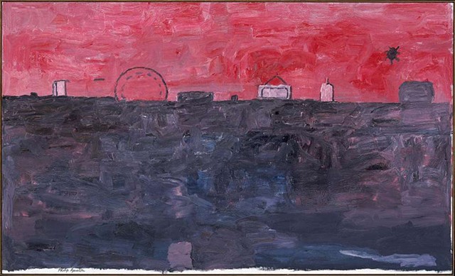
Ben Shahn, Ohio skyline, 1945
Bought a book on Ben Shahn recently (published in 1993 by Frances K. Pohl). Though he's best known for expressing powerful social/political commentary through figural work, Shahn's landscapes are extraordinary. Paintings like The Red Stairway (www.slam.org/collection/objects/36414/) are uncanny and surreal. The painting above is more grounded in a tangible reality, but still feels like a liminal space, anywhere and nowhere.
Teaching Beginning Painting for 8 weeks this Fall and looking forward to it. And a bit daunted. Still find the first few weeks of school daunting, even after 22 years of teaching!
In other news, two paintings of the "Stray" series are showing at Andrea Schwartz Gallery through Sept. 12.
June 6, 2024
Kyoto Space Cat!?!I returned from Japan three months ago, but I'm still savoring the experience. My sabbatical is over, I didn't get everything finished, and I start teaching figure painting next week. Mada mada desu.
Right now I'm in the middle of my first series since coming back from Kyoto / Nara, and I'm hopeful I can go further with this one. It's in a tender stage, not ready to share with the galleries, but at least the series has a name: "Stray." A stray kitty appears here and there, but the title is based on the location of the site, which is the Humane Society of the North Bay in Vallejo.
I hadn't planned on mining Vallejo again, but I was dropping off some extra dog food that Aki didn't like, and I saw these wonderful little yellow houses, just inside the gate, with folding chairs facing out. Like mini guard houses.
The exterior views are interesting, but the interior is something else entirely. You can stand inside one little house and look inside the other little house. There could be opportunities to go forward here... we'll see. I have four little paintings and one 22x24 and one larger one, 46 x 54" -- and that's the interior. The stretcher bars just arrived to make another large one and another 22x24. Then we'll see.
February 5, 2024
I've been drawn to buildings under construction lately, but these sites haven't been especially fruitful. Lately I make a few paintings in a series and then run out of steam, lose the plot, get distracted. The last time I really sunk my teeth into a series was with "Sunset," when I felt I'd gotten to absolute zero -- empty rooms, with a single door at most. Everything since then has been a mix of side quests, false starts, and dead ends.Side quest
I looked back at my "Woodcreek" series (painted in late 2021 on wood panels) and realized I hadn't even put them on the website; I just uploaded them now, and I really like them! (I think I'm the only one.)False start
I really like the hills around the park where I walk the dog, especially the color of the sky against the yellow or green grass (depending on the time of year), and the paths snaking down them. The paintings have gone nowhere, unfortunately. Landscapes without the structure of -- well, structures -- don't seem to work for me.Dead end
Well, there was "Peabody" (palm trees in rows outside the prison) and then "Fairgrounds" (big building under construction in Vallejo, along the highway) and now "Atlantic" (performing arts building under construction near the doggie daycare). Just a few paintings each, and though I like those paintings, they've received no love from the galleries. Even now, I'm looking at the photo I posted above and I'm thinking -- yeah, that would be a great painting at 4x5 feet! But nobody seems to want a dark painting, not in any size. Oh, it's a bad frame of mind for an artist -- quite mercenary, in fact -- but I have to be a little pragmatic. Why start a painting that's bound for rejection?Japan or Bust!
I've been in a grinder, working extra hard, under extra pressure, since the pandemic, feeling depleted and needing replenishment. I'm currently on sabbatical from teaching but I haven't let up...mada mada desu. I'm going to Kyoto and Nara for a couple of weeks and I'm hoping for a reset. If I find inspiration for a new series to paint when I get back, that'll be great, but I'm more likely to find my way once I give myself permission to stop looking for it and just wander. I have no sense of direction -- how hard can it be to lose myself for a while?September 24, 2023
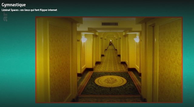
I was interviewed months ago for a short (5 minute) documentary on liminal spaces, and it's now online: www.arte.tv/fr/videos/110955-016-A/gymn…
Somehow my work has become associated with the internet's fascination with "The Backrooms." I finally caught the zeitgeist! (At least, for the passing moment.) The video is available in both German and French; in the French version I'm subtitled, but in the German version, I'm dubbed, which is a hoot. (There will be ANGST!)
I'm also going to have a couple of paintings included in a French coffee table book on liminal spaces.
These developments have been a nourishing autumn rain after a long dry spell. Hopefully I'll find inspiration for a new series this fall. But if not, I'm going on sabbatical in the Spring and will have some time to regroup, mentally and physically. Come on, January 2024, I'm ready! Let's go!
July 28, 2023
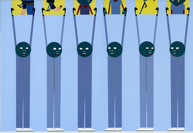
Laylah Ali,"No title," 2002
These palm trees make me think of Laylah Ali's figures. They are the same but also subtly different, antagonizing each other like they resent their own relentless parallelism.
July 16, 2023
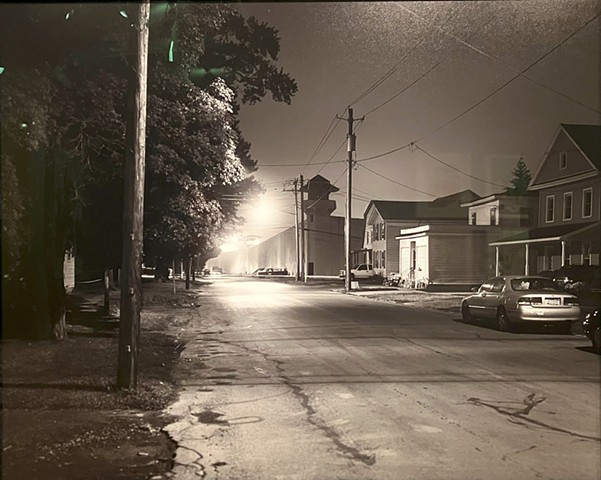
Stephen Tourlentes, Auburn, NY State Prison, 2003
Two rows of palm trees march relentlessly down a long drive headed toward the California State Prison. I've driven past this site on Peabody Rd. several times, and thought, yep, those would make a good series.
But for a long time I resisted pulling over and taking some pictures for reference. One reason: Palm trees are so California, so easy to "sell," visually graphic and easy to digest. All effect, no affect -- just eye candy. And pretty easy to paint, too! A satisfying mix of the geometric and the organic, with bowing verticals in even parallels, topped with a vague explosion of dark green and brown stuff. The sky behind, in any color you like (how about a classic California sunset?), providing intriguing pops of negative space.
But last month I visited the Oakland Museum's show, "Angela Davis -- Seize the Time," and finally I thought, well, let's do just that. Let's seize the time, since the "Sea Change" series had come to a close, and when all else fails ... there are always palm trees, fucking palm trees.
What led me to pile Aki into the car to drive up 80 at sunset was a series of photos in the exhibit by Stephen Tourlentes. (Just now, I was reminded to buy something that's been sitting in my wishlist too long: Nocturne: Night in America by Hélène Valance.) The "Sea Change" series is also a twilight series, and as I continue to be drawn toward the light of late afternoon and evening, I continue to think about the weighted symbolism of night scenes. And I had that thought in mind as I looked at the four photos by Tourlentes exhibited in the Oakland show. His photo Auburn, NY State Prison (above) evokes works like Black Night: Russell’s Corners by George Ault, 1943, quiet and lovely and disturbing.
Which brings me back to Peabody Road, and the question of whether I can make paintings of palm trees that are more than just palm tree paintings. In Peabody (CSP-SOL) no. 1, a row of formidable palms on the right bullies a distant stand of palms on the left. There's something anthropomorphic going on here... we'll just see how it goes.
January 16, 2023
Norman Lewis, Sea Change VI, 1976
In the past year, I've been focused on putting together readings (in lieu of a textbook) for "Diverse Art," a course that was recently approved to fulfill the new Ethnic Studies requirement for students looking to transfer to a California State University or a University of California campus. I was teaching the course in-person in Spring 2020, when the pandemic hit, and it was time to rebuild the class so I could teach it online this Spring.
This work, along with building or rebuilding the online content of six other courses (!) since Spring 2020, has definitely taken a lot of my attention. However, I don't see this work as being a distraction from my artwork, or responsible for "taking time away" from my painting. Indeed, writing about art has been enormously rewarding. The process of researching and then explaining the meaning and relevance of artwork to students, through the written word, has allowed me to perceive the artwork with greater clarity and depth.
My latest series, "Sea Change," is titled in honor of Norman Lewis (1909-1979), who created a series of the same name, late in his career. I see in his "Sea Change" paintings and prints a reckoning that is both personal and social -- which is also my intention with "Sea Change."
The works are based on photos I took at Asilomar in Pacific Grove, a spot my dad really loved and wanted to visit again, after a delightful 2013 trip together. In 2014, we returned, but it wasn't the same. He wasn't the same. The impact of age, both mental and physical infirmity, was evident -- something I was just starting to realize and reckon with. One evening, we sat in the Asilomar yoga room, just us, looking out to the cold ocean. He talked about guys he knew back at City College, NY. He spoke regretfully of life choices. After he turned in early, I went to the Asilomar bar and got a drink. The sun hadn't fully set, and I walked on the beach, feeling both foreboding and grief.
My dad's death in Jan. 2019, at the age of 89, was not shocking or sudden. But it meant the official start of grief that had really begun years before. My husband is experiencing this now -- the grief of losing a parent when they're still here. It is a sea change, when your parents, as you knew them, are gone.
I am returning, in this "Sea Change" series, to 2014, but certainly, as a society, we are undergoing a sea change now.
A colleague of mine insists that students must be forced to come back to campus -- take away the online option, and they will necessarily go back to in-person instruction. They will relearn the joys of true social interaction.
I strongly disagree. Not only is his argument based on unsound logic ("our students don't venture far, so they're stuck with what we offer"), it also ignores the larger reality. There is a fundamental change happening in "post-pandemic" education, and in society as a whole.This week, for the first time in nearly three years, I'll be stepping in front of a class again, in person. I will do so with the understanding that we are all dealing with a sea change of one kind or another. We're all just bobbing along.
July 3, 2022
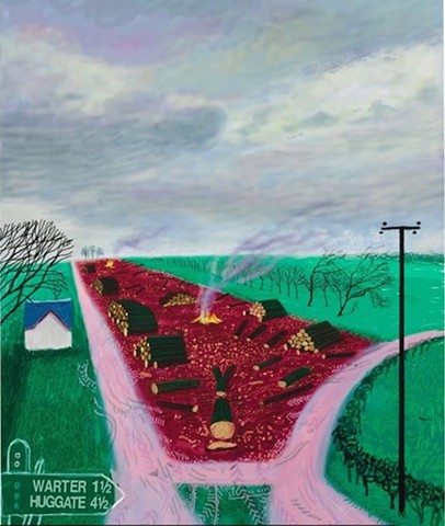
David Hockney's "Less Trees Near Warter," 2009 (detail).Landscape can be very effective in communicating a state of affairs. I started a series, "Uphill," this year, based on paths up and down local hills, but it just didn't go anywhere. (I made seven paintings on cherry wood but don't have the interest or energy to upload them to the website.) Just not enough solid, constructed stuff. It was all too nebulous -- and right now, I have no tolerance for nebulous.
Somehow I must balance the pursuit of healthy self care with ferocious moral outrage. Like juggling handsaws while practicing calligraphy. So, I've returned to the "Sunset" series, though I'm using photos of places beyond Sunset Ave. There are no shortages of empty store fronts, and "sunset" is really a state of mind.
This July 4 marks a kind of sunset. Nighty night, democracy! You barely broke through the clouds all day, and now you're going down.
July 4, 2021
(Roy DeCarava, Subway Ceiling, New York,1964, photograph.)
I saw DeCarava's work in the "Soul of a Nation" exhibit at the DeYoung in Feb. 2020. I don't think this one was in the show, but it was in the catalog.
The series I'm working on now has some of these elements, spare, very geometric. Interiors, like the "Portables" series, though in this case, I didn't actually go inside -- I just pressed the iPhone against the glass fronts of empty stores. Been feeling rather "emptied out," myself.
Earlier this year I selected ten paintings on wood blocks that weren't up to snuff, in one way or another, and painted over them. I tried a new series, three paintings that fizzled -- just too much stuff, maybe. So I started over again.
One of the "portables" (#6) sold at the Crocker Museum auction -- hooray for something!
December 18, 2020
Working on Waterman 9 for a show at Andrea Schwartz Gallery in February/March. I'm doing all I can to finish the semester before it finishes me! Meanwhile, I'm contemplating wiping out those trees on the left altogether. It's a bigger one, 58 x 64 inches. Not quite there yet.June 14, 2020
George Ault, Black Night: Russell’s Corners, 1943
A student brought George Ault to my attention this Spring semester --this most awful and difficult COVID-19 semester, in which we all switched to online mode halfway through. A painter capturing troubled times in disturbingly quiet scenes, both specific and surreal at the same time.My friend Sherri bought me the catalog from a show "To Make a World," and Alexander Nemerov's characterization of Ault's balancing act between specificity and generality has been very helpful for me:
"Without the precision of his rendering there would be no specific locality where these premonitions of global and even universal dread and mystery can group" (p. 36).
Nemerov contrasts Ault's approach with that of Hopper, who "aims for universality at the expense of precise location" (p. 38).
He draws a parallel between Ault's work and the poetry of Yvor Winters: "the hallucinated clarity of the cool California night becomes a medium for seeing the fates of others far away...Winters found in the 'dread sweetness' of a night without wind, without scent, a nightmarish vision of what otherwise could not be seen" (p. 25).
After reading some of the catalog, I revisited my paintings of "Portables" on wood. I had all ten of them in flux at once --still feeling my way, trying to figure out what direction to go in.
I've always enjoyed the raw, painterly approach, but as I refine the spaces, they tend to quiet way down, and tighten up. I'm not going to resist that inclination--I don't want a sketchy, moving world, rendered in impressionist or expressionist marks--but I don't want the clean geometry of these spaces to reduce the world into a spare video game of generic corners, doorways, and windows. Planes coming together in a nameless space. Aside from preserving the odd brush mark and texture, the key seems to be in specificity--including the plywood on the windows, the light that hits the ledge, the angles of the door jamb.
I think I'm dialing into this sweet spot between specificity and the stripped, simplified space, but I still have to decide to what extent I let a deliberately "incorrect" angle warp the space, or make a doorway intentionally too small, and provide a hint that things are "off."
June 19, 2019 --addendum
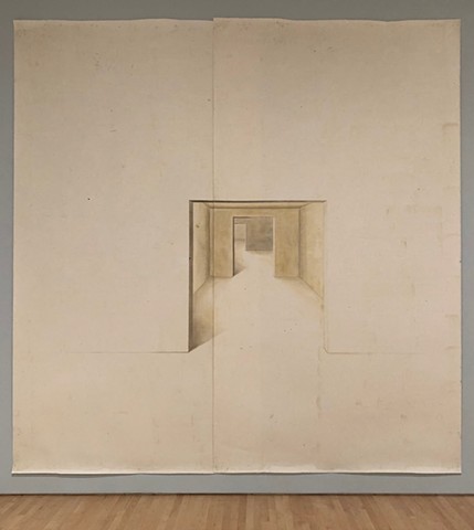
Working on the 3rd edition of Approaches to Art -- trying to diversify and streamline it at the same time. Saw this big drawing at the SF MoMA which I found intriguing and quiet, and maybe in the spare and surreal direction I want to go:
Toba Khedoori, Untitled (rooms) 2001.June 19, 2019
2018 was a year of changes. Almost a year ago, it was the 4th of July and Aki was having a very difficult night. As usual, neighborhood streets were popping with fireworks, and the only solution I found was driving a terrified terrier up 680 to a quiet little corner of Fairfield, not far from the emergency vet and campus.
I resolved over the next few weeks to start the process of selling the house in Vallejo for what I could get, in order to move to someplace quieter, more private. It was a rough few months, but eventually getting a new house in a new town meant not only more space (mental and otherwise), it was also an opportunity to rethink my subject matter and approach.
First objective: get inside. I've been peeping too long through chain link fences and was determined to get access to my new object of affection--the defunct water treatment plant on Waterman. Not only did I receive permission to photograph inside, I was allowed to come back and do some watercolors on site, like the one above.
After painting a couple of tentative 22 x24" paintings on canvas, I decided a few weeks ago to head down to Macbeath and get more hardwood for block paintings. These have taken me more decisively in a new direction, something more surreal and tonalist. I'm not sure why and where it's going, but it likely has something also to do with the other big change of 2018.
Not long after Thanksgiving I found out my dad was dying of cancer. He didn't know--one of dementia's odd gifts--and so my trip to see him in December, just after finals, was just a nice surprise.
So 2019 started with a funeral, as I knew it would. And then a new spring semester and a new house with many problems... and here we are in summer, with a long series of car-related fiascoes and a new summer semester... and my mind is still trying to catch up with itself. All of that is weirdly wrapped up into Waterman, which is inside and outside at the same time. Like the opening of "Television Man" by the Talking Heads:
I'm looking and I'm dreaming for the first time
I'm inside and I'm outside at the same time
And everything is real
Do I like the way I feel?January 16, 2018
"Signs Point To..." is now open at the Herger Gallery at Solano College, Fairfield, CA!I'm joining Alma Chaney and Susan Alta Martin, my fellow 2010 SFAI alumnae, in a show exploring the slippery nature of signs, and our increasing difficulty (as a society, and as individuals) in reading what the signs might point to. Of course, politics is at the forefront of our minds, but the work is "open for interpretation" (which happens to be the name of one of Susan's series of photos, featuring blank billboards in rural NC).
The closing reception is Friday, March 9, from 4-6.
July 13, 2017
Ed Ruscha, Station, 2003
The Diebenkorn show at the DeYoung in May was so delicious, but the show on Ruscha (Sept. 2016) is still sticking to my ribs. I'm wrestling with issues of space. The panorama layout is less suffocating; maybe it's the political insanity of 2017, but I want to keep pulling back to the widest possible view. And simplify, simplify, simplify. 907 no. 2 is still loaded with specificity. I wonder how much information I'm willing to let go. The flatness of D's Ocean Park series isn't for me, but Ruscha's silhouettes intrigue me.
Keeping with nearly-square canvas dimensions, that leaves a lot of sky and a lot of ground. I want to see a Philip Guston show for inspiration (floor 5 of the SF MoMA has some from the Fisher collection, so maybe I'll make a special visit).
Other inspiration comes from Nainsukh of Guler. There's no such thing as too much negative space.
Philip Guston, The Deluge, 1969.
Nainsukh (c. 1710-1778), Watching the Rain Clouds (Balwant Singh on His Palace Roof).
May 2, 2016
It's the start of May and the semester is almost over. I finally finished VELPCo large no. 1, after a lot of dialing back and forth--not quite tuned to the correct station. I'm thinking I need a fresh set of photos of the building to get a new handle on it. I don't know if I learned anything about how to tackle the site, even after months of puttering and fussing with my first big VELPCo. And after all this time I still have no idea what VEL&P stands for.January 2, 2016
I'm in the middle of a series tentatively called "Wilson and Old Wilson." A few weeks ago I tried to make watercolors of this place, but they failed terribly; I wound up doing watercolors of the Vallejo Fire Department building (the kind that's built to be repeatedly set on fire, for practice) instead. But the series is coming along well, now that I'm painting in acrylic on those beautiful mahogany blocks.I'm trying to be extra tender with this series; the colors are sweet, the light is sweet, everything is gentler than usual, because the place itself is ....in need of care. It encapsulates 2015; I need--we all need--a bit of gentleness to start the New Year. I'm hoping I can be blunt and gentle at the same time.
December 27, 2015
Well, it's been quite a semester! In August, we adopted a puppy from the Benicia/Vallejo Humane Society, a three-month-old terrier mix (Scoland Terrier? maybe??) found wandering the streets. She is the cutest thing in the whole wide world! But oh, am I not cut out for parenthood. Fortunately we both survived housebreaking.Also starting in August, I had to take on an Asian Art History class, because the original instructor had to bail. I've taught Asian art before, as part of a World Art class, but never as a stand-alone class. So all semester I was just barely a step ahead of the students. It took about eight to ten hours a week, just to prep for that class. But I learned a lot about Asian art, and the class was filled with really wonderful students, so it all turned out fine. The biggest downside was that I was already slated to teach six classes (two online), so that brought the total to seven. I think I'm still exhausted. (Did I mention the puppy?)
There was one other delightful/demanding development this semester: I've signed a contract to write the second edition of Approaches to Art. Since now it's official, the clock is officially ticking, and I have to get the revisions done in the Spring. (No rest for the wicked!). Spring Break is already booked, though; I'll be travelling back East to see family, since I'm staying put this Winter break. It's a very brief break this time, anyway--the semester starts Jan. 11!
I'll be starting 2016 with three series in the works. The first is the least cooked: "Wilson and Old Wilson" didn't turn out well as watercolors, so I'm hoping they'll come to life as paintings on wood. I'm currently prepping gorgeous blocks of mahogany wood (2" thick by 7" wide, cut to 8" long). I found the board at White Brothers Millworks in Oakland. (These pretty hard woods are getting difficult to find at 2" thickness. My next stop will be MacBeath in Berkeley.)The next series is VELPCo (named after the VEL&P Co. building near the waterfront in Vallejo, on Kentucky St.). It's such a beautiful site. There's something about it that reminds me of Chartres.
Third is VFD, a series of watercolors only at this point, of the Vallejo Fire Department practice building.
Right now there's plenty to work with; now that I finally have the luxury of time, I'm taking a few days to make supports. I was hemming and hawing about the dry grass color in the VELPCo paintings for weeks, so I'm happy to leave the fine-tuning stage and go back to square one.
August 9, 2015
It's almost time for the start of the fall semester! This summer has been more active and stressful than I would've liked, but some good things transpired along the way.I met with Lisa Cooper of Elisa Contemporary Art, and she offered to represent my work in New York, which is very exciting. She hopes to have a group show in the fall featuring artists with structural imagery.
Also, I'm delighted that a couple of professors (one in Wisconsin, one in San Francisco) are adopting my Approaches to Art textbook for the coming semester. I'll be starting work on the second edition...sometime soon ?!
In addition to Art Appreciation, this fall I'm teaching Art 001 (Art History, Western art through the Middle Ages) and Art 012 (Diverse Artists), and I'll be using a new workbook I designed to be more interactive and user-friendly. More short exercises, fewer big assignments, and perforated pages so students can hand-write and hand in their work. It's a bit old-school, but there's something enticing about 14-point font and perforated pages.
January 25, 2015
I saw the Keith Haring show a few weeks ago (at the DeYoung in Golden Gate Park), and it made me think about my years of struggling to create meaningful figure-based artwork. Here is a guy who developed a personal vocabulary with the figure, one that was authentic to his experience but also addressed broader (often global) social and political issues. (I just watched the documentary, "The U.S. vs John Lennon," and similarly, you have an artist using his medium to express a social/political message, while keeping it personal--living what he is singing about, essentially).Building a personal vocabulary is really the essential job of the artist. And, like every vocabulary, it must be understood by the person using it, and it must change and grow. It is an ongoing process. The worst thing is to be bored by your own vocabulary: "Blah, blah, blah! Blah blah, blah blah!"
August 25, 2014
The show with Wynne Hayakawa at Andrea Schwartz Gallery has come down, the Fall semester is underway, and it's time to reboot.I'm working on three paintings right now, none of them fully resolved. Trying to see if a series is emerging.
April 19, 2014
I've updated my artist's statement again....it only has two pretentious words in it, which for an artist's statement isn't so bad, I guess.I'm sorting through the Lemon series to see what might go into the summer show at ASG. I finished three paintings this week, since I was on spring break. It felt good to disappear into the studio for a while.
Coming up!
The Hospitality House auction will be Thursday, May 8 from 6-9 at White Walls and the Shooting Gallery in SF. I'll have a little piece in the silent auction. For more info, see the Hospitality House site.
February 4, 2014
I took a detour from the Lemon series, as I was asked to paint a few works featuring prominent palm trees for the Palm Springs Fine Art Fair. I'd done a little painting in the Mare series with a palm-lined street, a big white building on the left with palm shadows on its side (Mare, small no. 11). So I went back to the other photos I'd taken of that street. I got curious about the little building in the back, a perfect little cube with a single door, and on my way back from looking for a used car to buy in Petaluma (long story) I stopped off at Mare Island to get the number of that little cube. Turns out it's H-66, so that was the impetus for the Mare 66 series.I was reticent to go back to Mare as a subject, because I fear it's been used and abused of late (see August 5, 2013, below). I don't want to be one of those "decrepitude fetishists" or neo-Romanticists, seeking some moralistic nostalgia kick, in and amongst the decay: "behold, the fall of the American Empire!"
The last time I painted palms, it was with a sense of delight at how ridiculous they are, impossible and improbable. I was having fun with how bad I was at painting them. "Here ya go, let's just say that's a palm tree, you get the idea." But this time, the palms became much more declarative, almost belligerent. "You want palms? Oh yeah, we got palms. Our palms can beat up your palms." They're sentinels now, big brothers and sisters to H-66 and its little boxy cousins below. Even the sky has to work its way around them, instead of the other way around.
December 28, 2013
I've received happy word that I'll be in a show again with Wynne Hayakawa in July, 2014 at the Andrea Schwartz Gallery. I'm still very invested in the Lemon series I started a few months ago, so I'll be working on more additions to that series for the summer show.I took some more pictures today, but there were too many cars in the way (all of sudden there's traffic on Lemon St.!) Tomorrow is Sunday, so maybe things will clear out.
November 3, 2013
The art appreciation textbook has officially launched!
I've added a folder in the "Art" section with more information. The book will be available through Amazon.com and Barnes and Noble's website soon, but it can be previewed and ordered now at the publisher's website.
October 27, 2013
Friday, Nov. 8, at 6 pm, is the "Celebrate Vallejo 2013" auction at the Vallejo Naval & Historical Museum. I donated two pieces for the auction, Mare, Bunkers,No. 1 and Mare, Bunkers,No. 2.
In other news, I have updated my artist's statement. It was overdue. I keep trying to make it closer and closer to "honest" without sounding over-earnest. And I wanted to be sure to keep the "personal reconnaissance" line at the end, as I really like it. I have directional dyslexia, so reconnaissance is always a good idea.
August 25, 2013
Just finished painting a large Lemon, and I'm happy. I've started to realize that I need more information for my larger paintings--big and minimal just doesn't cut it. Possibly in retaliation for my earlier "sky issues," this one cuts off at the trees. In fact, I was really going green for this one! (and used up my pthalo green in the process).I'm really liking the Liquitex Ultra Matte Medium, but it has a couple of hitches... first, the largest size is 16 oz...and second, although it can be cut with up to 25% water --- DON'T ADD THE WATER until ready to paint.
Otherwise, pre-mixed with water, the medium solidifies at the bottom of the bottle in a matter of days. Hmmm... a little design flaw. But unlike Golden's Matte Medium, the Liquitex ultra-matte really means matte, not satin. Probably thanks to whatever magic ingredient solidifies at the bottom when mixed with water! I'm ordering larger bottles of my Golden's fluid matte paint from the Italian Art Store online, and it's a good combo.
August 5, 2013
The new semester is approaching in a week, and we are under-enrolled. One theory is that the economy is getting better, so people are going back to work, rather than take community college classes. Another theory is that the sequester has hurt our students, so they are going back to work, rather than take community college classes.This summer I decided to finally let go of the Mare series. After hearing about people coming to Mare Island to ogle the decrepitude, and seeing those cliched photos of Detroit (abandoned Victorian in the foreground, desolate skyline in the background), I've grown wary of "economic collapse porn." I'm reminded of a print by Hogarth, the last of the "Rake's Progress" series, where well-to-do ladies get their kicks by visiting the insane asylum. "Oh my god, how awful, tsk tsk, titter titter." Mare too easily becomes a mundane Symbol of Economic Reckoning ("see, that's what those pesky Union pensions have brought us!"). Everyone likes a morbid, romanticized morality tale-- the Death of Sardetroitalus.
Plus, my experiments with dramatic clouds was short-lived. Having sky, buildings, and ground all in play at once was one variable too many. And I've never been that interested in "mood light" -- I love it in other artists' work, but it's not my bag. I like the stark shadows of mid-afternoon. Boxes of shadow within boxes of buildings...no need to go to the Parthenon to find the golden mean, it's right here.
So I've moved back to Lemon Street, figuratively speaking. In the longer view, I'm not sure where I'll go from here, but this little stretch of Lemon is colorful and boxy, and works in a pinch.
July 31, 2013
Juvenile Detention Facility mural completed!The summer mural class was small (very small) but mighty. Here is the press release, on the Solano College website:
April 02, 2012
Enjoying the remains of Spring Break (such as it is/was), and about to head back again to Dick Blick.The cloudy Mare Island series has been both intriguing and vexing. Sometimes I think it's really promising, and then I think it all looks amateurish--putting the "picture" over the substance. Still trying to find the sweet spot between sky stuff and ground-plane stuff.
February 28, 2013
This has been a particularly challenging semester, but it has had a few bright spots. I am preparing to teach Mural Painting in the summer, which should be an intense but fun six weeks.My Art Appreciation textbook is being prepped for fall publishing by Cognella Academic Publishing, after what seems like endless edits, tweaking, illustrating, diagramming, and overall fussing.
I am still painting images of Mare Island, but have switched over to being cloud-obsessed. One big variable, and I'm back to not being sure about anything, which is a good place to be. I'll hopefully have another show at Andrea Schwartz Gallery in 2014 (they are working on the schedule now), so there is plenty of time for me to play with this new direction.
I'd say things are moving at a glacial pace--that is, things are steadily picking up speed (and melting into the ocean).
October 14, 2012
I'm tired all the way down to my bones today, but still feeling like my head is above water and I have just enough energy left to paddle. My dad mailed me two Trader Joe's soups and crackers, along with a bunch of brushes, so I'm happy.Also, Soraya Murray of UC Santa Cruz (art historian in the film/new media dept.) came to the college to speak last Thursday, and it was such a treat. I never invite anyone to do anything, being the high-strung and socially-awkward non-networker that I am, but I was so glad she was willing and able to share her experience with our students. So now I'm averaging one guest speaker a decade. I'm okay until 2022, by which point we'll have holographic teleconferencing through timespace.
In related news, I am trying to arrange my schedule so that I will have Wednesday nights free to attend openings at the Andrea Schwartz Gallery. I have bought ridiculously-high-heeled shoes and I need an opportunity to wear them, so that I can concentrate on my feet rather than on how much I don't know what to do with myself at openings.
I am working on a thousand different things at the college, but I'm still also plodding away with the Mare Island series. I have no idea how to paint palm trees, as they are the most absurd plants growing in the most absurd places (see, I am blaming them for my own inadequacies). Mare Island is starting to look like the sunset strip in LA. But it's not my goal to turn into David Hockney and start painting naked men in pools.
August 26, 2012
Still working on the Mare series, and after a bit more experimentation, I decided to switch to Golden Matte Acrylic. I just wasn't convinced by the Flashe paint, lovely though it is; maybe it might work better on paper than canvas. The Golden Matte is definitely... matte. I think I like it!
July 29, 2012
Lemon's End was in the local news recently--not my paintings of Lemon's End, but the actual site (see my news entry from November, 2010). I would love to see at least one place I paint get a second life--although I imagine the old factory on Derr St. will get torn down, to make way for the planned shipping hub. Plans have a way coming undone, however. In short, I'll believe it when I see it!Former General Mills Site May Become New Shipping Hub, Vallejo Times-Herald, 7/25/12.
In other news, I have started painting exclusively with Flashe vinyl paint, made by LeFranc et Bourgeois. It's a little wacky and takes some getting used to, but at least I have some sense of its track record, since they've been manufacturing Flashe since the 50s. I like its matte quality, but I'm not sure if I should be thinning it with water (as recommended) or with matte acrylic medium. The website is in French, and the fact sheet is not entirely forthcoming.
Happily, a couple of my little works on paper, from the new Mare series, were accepted in the FATE Biennial Members Exhibition, a juried show at Savannah College of Art and Design this coming April. I don't know if I am presenting a paper at next year's FATE conference (Foundations in Art: Theory and Education) --my proposal didn't make the first round--but at least my art will be there. I think Artist Ferd is looking for bragging rights over Professor Ferd. But since Professor Ferd pays the bill and Artist Ferd can barely meet expenses, it's not much of a contest.
I am squeezing in a quick trip to Washington, DC, before the start of the Fall semester. I'll be teaching two sections of Art 10 (Art Appreciation), two Art 1's (Western art history through the Middle Ages), and Art 12 (diverse artists in the U.S.).
July 7, 2012
It is time to find a more stable alternative to flat latex (house) paint. I have been using matte acrylic medium, but that doesn't flatten as much as I'd like. I bought a few little bottles of matte acrylic from Dick Blick...and they're...just OK.Next week, my order of Flashe paint--recommended by the sagacious SF artist and adviser Leonie Guyer-- should be coming from Blick, so I will give those a whirl.
Something about the ridiculous matteness of house paint has been working well for me; acrylic just wants to shine, it all its plastic-y glory, and it bugs the heck out me.
It's possible to kill the luscious gloss of oil paint, but that would be a crime-- I love it too much to dull it down. I committed too many crimes as an undergrad, in my ignorance thinning everything with mineral spirits and softly killing color with wanton, ever-muddying abandon.
June 13, 2012
Today I finished putting a window A/C unit in the studio, and tomorrow it should be nice and cool in there. It took two full days, because the existing window was unfinished--a two-foot square hole with a piece of glass held in place by molding, surrounded by raw wallboard. So I had to make a proper window, before putting the A/C in it. (It's still not exactly "proper"--it doesn't bear close inspection--but it's caulked plenty good!)At the beginning of this month, I decided to go back to Mare Island to take more photos--since the last set was taken in 2009, when I was on the lookout for different things.
When I looked through all the photos, I found four different categories emerge. I'm not sure which will bear fruit--but I finished a painting with a string of bunkers (?) in front of a stand of eucalyptus and some pines.
Another, which is almost done, isn't actually Mare Island, but it's close enough (towards the very western end of Tennessee Street). I happened to catch a bird taking off, in front of the building, so I left it in. An actual mammal!--a very exciting development.
May 29, 2012
I've finally posted images of a few of the monotypes I made with Jeanne's help this past semester. I'm still working out the kinks, and I really don't know about the color monotypes (it's a whole other ball game, compared to painting in color, and I have no idea why!).The Spring '12 semester is officially over. Over and over, the word of the day, the word on the street, the first and last word, has been FUNDS. As in, hey art department, go raise your own. Make yourself useful (job-creating), and maybe some Career/Technical Education (CTE) money will flow your way.
On our left flank, the Student Success Task Force, the state legislature, and the Chancellor's office are all saying "damn the community, transfer those puppies! Basic skills! (no, art doesn't count as one of those). Get 'em in, get 'em out, get 'em to decide right away what degree they're aiming for (no time to discover their skills, no time to experiment, no time to find their way--it's the on the state's dime, after all, and the clock's ticking).
On the right flank, No Child Left Untested has become Race to the Bottom of the Pile, and our students are less inquisitive, on the whole, less open to discovery, less prepared, less enthusiastic, and more (and justifiably) wary. They've seen their teachers shuffled, their schools shuffled, their classes cut, and now, all of their summer classes cut (at least at my college).
Still, we forge ahead. Vote for the tax hikes, because we are going to need every last dime to keep the lights on.
April 12, 2012
Printed a relief print at the Compound Gallery in Oakland today--a little linocut from the Garford series (thanks to Jeanne Lorenz's expert work with the self-inking press).My dad's here visiting from Annapolis, and we've been dancing between the raindrops (getting a lot of late-season rain), touring wine country and enjoying great food in Sausalito (The Spinnaker), San Francisco (The Stinking Rose), Napa (Bistro Don Giovanni), and of course, lovely Vallejo (Good Day Cafe and China Wok). We've been eating our way through the week, and painting. Three new, little Garford paintings on wood, finished this week, are now posted on the "recent work" page.
March 22, 2012
Last month I re-organized and re-designed the studio, and did a minor painting purge (which stalled my studio work for a month, but ultimately brought the studio back to a fresh, ready, re-set state). In the process, I abandoned several underwhelming, would-be candidates for the Garford and City Limits series. (Their skeletons are waiting on my next trip to Dick Blick in Berkeley, since I'm out of canvas to stretch). In an attempt to reboot, I did some ink drawings on paper and some festive little watercolors from those two series. It seems that the Garford compositions have the most promise, now that I'm getting back to painting on canvas again.Also in the past month, I have been having a ton of fun working with my fantastic colleague, collaborator, and co-conspirator---artist Jeanne Lorenz---on making a series of Garford monotypes.
I love love love monotypes, but have neither the know-how to work a press (without damaging it or me), nor the sense of timing and touch to get the paper soaked and blotted and placed just right, nor the discipline to keep my grubby paws from putting inky fingerprints all over my paper. As both a painter and print-maker, Jeanne has such a keen knack for the technical aspects of the process--and she has super color skills and a strategic painter's mind--making it a really fluid and cooperative creative process.
It is such a treat to work with someone and have those back-and-forth discussions of what's working and what's not (like graduate school, but without the stress).
The process has yielded some surprising results--I think I'm getting closer to getting close to something! It's actually a liberating feeling, not really knowing what that something is. With painting, I have an almost too-codified standard of "yes, that's it." Doing monotypes lets me let go, and take bigger risks than I would normally take.
I'm looking forward to maybe making some prints with Jeanne's help this summer at the Compound Gallery in Oakland. I feel like a kid in a candy shop!
February 2012
I have finally joined the land of Tweets (having run away--with all haste and with no fanfare or regret--from Facebook).
Although I spend most of my workday shooting my mouth off, I really have nothing of consequence to twitter about. (I can barely manage one update a month on this site!)
But, what the heck, you can follow me anyway, @ThatFerd.
Reading over January's post, I must confess that all my works-in-progress on canvas failed miserably. I pushed them and pushed them, until they got pushed right over the edge. Compositions that really sang in watercolor just lay there like a dead duck in acrylic. Quack, quack, croak.
Along with my painting woes, I had to re-configure the studio over the Presidents Day holiday; it had to absorb a whole storage-space full of large paintings, which weren't earning their keep at the StorQuest. The result is definitely a smaller space in which to paint, but it's cozy and still workable.
January 2012
So glad to get this year underway, and put 2011 to bed.I happily wrapped up the last few days of last year with some watercolor paintings and ink drawings. They are part of a new series indulging my wall/fence/shadow obsession, which began with Yellow Cab (no. 5).
The new series is actually two in one: "City's Limits" features a site not far from a city limits sign (although I'm baffled as to why the sign's there, as I'm sure it's right in the middle of the city and nowhere near its limits. To be sure, though, the city does have its limits). "Garford" is a strange little street, not more than an alley, that just keeps going.
The works on paper are preceded by a group of four paintings on canvas (one large, three smaller) that are still works-in-progress.
October 2011
A couple of months ago, I started making paintings that are nearly square, at 22" x 24" I have three in the Lewis Brown Series, but I think that Lewis Brown is just about wrapped up, so I'm looking forward to starting a new series, in this "nearly square" (n.s.) size.
August 2011
Fall is coming--although it's been feeling fall-like almost all summer in Vallejo. The Lewis Brown series is still underway, and I'm getting ready for the new semester. Despite budget cuts and cancelled classes, I'll be teaching a full slate of courses (though I had to take one from an adjunct professor). There will be a lot of students looking to enroll on the first day, with remaining classes over-full. My schedule for this semester:Art History 1
Art Appreciation
Modern Art History
Diverse Artists (U.S.)I'm hoping mid-year cuts are not in the cards, but that depends on the gap between projected and actual revenue in CA. We may be in for a bumpy ride.
On the bright side, the show at Andrea Schwartz Gallery came down with a few pieces sold. I'm still hoping people with bigger walls than mine will be hankering for a room full of big paintings.
July 2011
The show at Andrea Schwartz Gallery is going well. Dewitt Cheng wrote a thoughtful review for Visual Art Source: Editorial: Recommendations.June 2011
My show with Wynne Hayakawa at the Andrea Schwartz Gallery will be open through the end of July.It's a great space, and our paintings compliment each other well. Wynne's work features abstract, organic landscapes of verdant, spring colors. My work shows urban landscapes, geometric and sometimes indeterminate.
I'm showing a few small paintings on wood, and three large paintings. And a rare medium-sized piece, which is my personal favorite (from the Yellow Cab series).
I ran across a thoughtful and positive review of the show by Oakland artist Sarah HaBa, which you can read at her site: Sarah HaBa.
March 2011
I am hoping to finish at least two more big paintings for the "Yellow Cab" series before my show in June. My compositions and palette have grown a bit starker with Yellow Cab (large, no. 1). Maybe warmer colors will return when the California budget looks better!
January 2011
Solano CollegeIf the funding gods come through, I will be co-presenting a paper with colleague Marc Pandone at the FATE (Foundations in Art: Theory and Education) Conference in St. Louis, March 30-April 2. The topic is "What's Appreciation Got to Do With It? --Building the culturally-literate citizen through art education."
My schedule for the Spring 2011 semester:
Art 3- World Art History (MW)
Art 10- Art Appreciation (MW and TuTh classes)
Art 2- Art History [Renaissance to present] (TuTh and Tuesday night classes)Art
I was bowled over by the James Castle retrospective last year at the Berkeley Art Museum; his drawings are incredible. Looking through the catalogue today, I decided to begin a new series of drawings (in graphite on paper) for the New Year.
November 2010
I'm working on a new series, called "Lemon's End." I was able to take some photos of a semi-abandoned factory at the end of Lemon St., and the neighborhood leading up to it.Lemon gets a little quieter (and weirder and sadder) as it nears the Carquinez Strait, turns a tight left and becomes Derr St. I took these photos in August, but am now starting to do large and small paintings from them.
My work has taken a turn for the unyieldingly geometric-- almost as if this world has become hermetically sealed. As though no new air has been pumped in here since 1978. Deep breaths! Deep breaths!
August 2010
Artwork
I have been working on the Everett Road series, and have just prepped 13 new wood panels for future work. The panels were cut from a 9 foot plank of lovely cherry wood, 5.5 inches wide and 1.5 inches thick (ordered through Dolan Lumber).
I am also pleased to announce that the Andrea Schwartz Gallery in San Francisco has offered to represent me.
Solano CollegeThe Fall semester begins this month, and I will teach five classes:
Art 1 (Art History), sections 80088 and 80089
Art 10 (Art Appreciation), sections 80095 and 80096
Art 12 (Diverse Artists), section 80099.I am currently preparing my Sabbatical (Spring 2010) report, and shopping my completed Art Appreciation textbook to publishers.